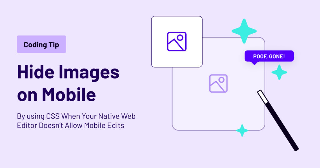
Using CSS to Hide Images on Mobile
As a web developer, I’ve often found myself in situations where I need to make mobile-specific design changes, but my native web editor doesn’t provide the tools for mobile editing. One common challenge is hiding images on mobile devices when they are not needed. While some web editors have responsive design features, not all of them do. In this blog post, I’ll share a workaround I’ve used to hide images on mobile using CSS, even when my web editor lacks mobile editing capabilities.
The Problem: Limited Mobile Editing in Native Web Editors
Most modern websites need to be mobile-responsive to provide a seamless user experience across various devices. This often involves adjusting the layout and content for smaller screens, and sometimes, hiding certain elements like images that may not be necessary or could clutter the mobile view. However, not all web editors offer dedicated mobile editing features, making this task challenging.
The Solution: CSS Media Queries
When your native web editor falls short of mobile editing capabilities, CSS comes to the rescue. CSS media queries allow you to apply specific styles based on the screen size or device type, enabling you to hide elements on mobile devices. Here’s a step-by-step guide on how to do it:
- Identify the target image: First, determine which image(s) you want to hide on mobile devices. This could be images that are too large for small screens, decorative images, or anything else that doesn’t add value to the mobile experience.
- Add a class or ID to the image: To target the specific image(s), give them a unique class or ID attribute. You can do this directly in your HTML code or within your web editor.
- Write the CSS media query: Now, it’s time to create a CSS media query that targets mobile devices. Typically, you would use the
@mediarule and specify the maximum width at which you want the styles to apply. For example:
@media (max-width: 768px) {
  .hide-on-mobile {
    display: none;
  }
}
In the above code, any element with the class “hide-on-mobile” will have its display property set to “none” when the screen width is 768 pixels or less, effectively hiding it on mobile devices.
- Apply the class to your image(s): Finally, apply the “hide-on-mobile” class to the image(s) you want to hide on mobile devices.
<img src="your-image.jpg" alt="Your Image" class="hide-on-mobile">While some web editors offer robust mobile editing features, others may lack these capabilities. Fortunately, CSS media queries provide a practical workaround for hiding images on mobile devices when your native web editor falls short. By following these steps and adding a few lines of CSS code, you can ensure that your website looks great on all screen sizes, even when your web editor doesn’t offer built-in mobile editing tools.
Remember that responsive design is essential for providing an optimal user experience, and hiding unnecessary elements on mobile devices is just one aspect of it. Explore other CSS techniques and best practices to ensure your website is mobile-friendly and user-friendly across the board. Happy coding!