Understanding the box-shadow CSS Property
As a graphic designer, I love finding ways to add depth, personality, and a little magic to my designs. One of my favorite tricks? The box-shadow CSS property! Think of it as the digital equivalent of a soft spotlight or a bold neon sign—it’s all about making elements pop.
What is box-shadow?
The box-shadow property lets you add drop shadows to elements, giving them a sense of depth or even a glowing aura. It’s like giving your design a little extra flair—without needing a Photoshop filter!
Syntax Breakdown
The basic syntax of box-shadow is:
box-shadow: offset-x offset-y blur-radius spread-radius color;- offset-x: Moves the shadow left or right (negative values go left, positive go right).
- offset-y: Moves the shadow up or down (negative values go up, positive go down).
- blur-radius: Controls how soft or sharp the shadow looks.
- spread-radius: Makes the shadow bigger or smaller.
- color: Pick your favorite shade—go subtle or go bold!
Want multiple shadows? No problem! Just separate them with commas, and stack up those layers like a digital sandwich.
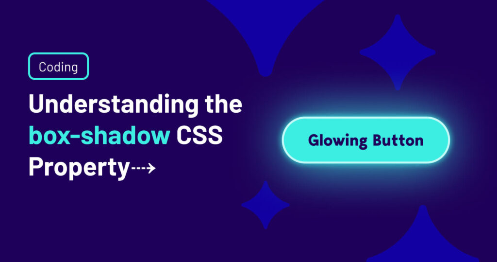
Creating a Glowing Button Effect on Hover
Now, let’s make something fun—a glowing button effect! Because who doesn’t love a button that looks like it belongs in a sci-fi movie?
Example: Glowing Button Effect
.purple-button {
  background-color: #5700FF;
  color: white;
	font-weight: 900;
  padding: 8px 12px;
  font-size: 16px;
  border: none;
  border-radius: 100px;
  cursor: pointer;
  transition: box-shadow 0.3s ease-in-out;
}

.purple-button:hover {
  box-shadow: 0 0 15px 5px rgba(87, 0, 255, 0.7);
}
What’s Happening Here?
- The .button class gives us a sleek, modern button with smooth edges.
- When hovered, box-shadow creates a glowing aura, making it feel interactive and alive.
- The transition effect ensures it doesn’t just pop on abruptly—it gracefully fades in, like a well-timed stage light.
Why Designers Love box-shadow
Shadows aren’t just for fun—they serve a purpose. They add hierarchy, guide the user’s attention, and create a sense of realism. Whether it’s a subtle lift to make a card stand out or a full-on neon glow, box-shadow is a secret weapon for crafting visually compelling designs.
Final Thoughts
CSS isn’t just about function—it’s about form, too. By mastering properties like box-shadow, you can inject personality, fun, and a bit of drama into your designs. So go ahead, experiment, and give your buttons, cards, and elements the glow-up they deserve!