Mastering Design Harmony: The Unsung Hero – Negative Space
Hey there, design enthusiasts! Today, I want to dive into a topic that often goes unnoticed but wields immense power in the world of graphic design: negative space. You might be wondering, “What’s negative space, and why should I care?” Well, my fellow creatives, prepare to be amazed by the unsung hero who can transform your designs from good to breathtaking.
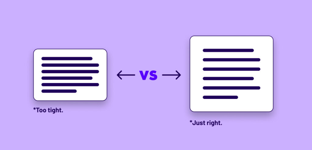
Negative space, also known as white space, is the empty area around and between the main elements of your design. It’s the canvas’s breathing room, the quiet pause between musical notes, and the breath of fresh air your eyes desperately crave amidst visual chaos. So, why is it so crucial? Let’s explore.
1. Embracing Balance and Harmony
Imagine a teeter-totter with two people of different weights. For it to be in perfect balance, you need the right amount of weight on each side. Similarly, a well-designed composition requires balance. Negative space plays the role of the counterweight, allowing the main elements to shine without overwhelming the viewer. It establishes a soothing equilibrium that guides the eye gracefully across the design.

2. Allowing Focus on the Essentials
Think of negative space as a spotlight on a stage. When used effectively, it directs the viewer’s attention to the star of the show: your main design elements. Whether it’s a captivating headline, a stunning photograph, or a sleek logo, negative space gives them the spotlight they deserve. By reducing visual clutter, it lets your audience absorb and appreciate what truly matters.
3. Enhancing Readability and Comprehension
Have you ever stared at a jumbled mess of text, desperately trying to decipher its meaning? Negative space can be your typography’s best friend. Ample spacing between lines and characters improves readability, making your message crystal clear. It’s like the pause between sentences, allowing the reader to absorb the words and understand the narrative flow.

4. Igniting Creativity and Depth
Negative space isn’t just about the gaps; it’s about what those gaps can create. It’s the magic trick that turns two simple shapes into a clever optical illusion or a hidden symbol. By leveraging negative space, you can add layers of meaning and intrigue to your design, engaging your audience on a deeper level. It’s the design equivalent of a satisfying plot twist!
5. Evoking Emotions and Elegance
Have you ever marveled at a design that seems to radiate elegance and sophistication? Chances are, negative space played a significant role. It’s like the silence between musical notes that evokes emotions and creates a mood. Subtle and well-placed negative space can make your design feel high-end, polished, and oh-so-chic.
In a world where we’re bombarded with visual stimuli, the art of using negative space is more crucial than ever. As graphic designers, we hold the power to guide the viewer’s gaze, convey complex messages, and elicit emotions. By embracing negative space, we elevate our designs from mere visuals to captivating experiences.
So, my creative comrades, the next time you’re crafting a design, remember the unsung hero that is negative space. Embrace its power, dance with its elegance, and wield its magic. Let it be the gentle whisper that amplifies your design’s voice and transforms it into a masterpiece. Happy designing! 🎨🖌️
