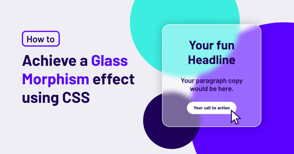
How to Achieve a Glass Morphism Background Effect with CSS
Glass Morphism is one of those sleek, modern design trends that keeps making a comeback—especially in UI design. It gives a frosted-glass effect, making elements appear semi-transparent while maintaining a soft blur. This effect is great for adding depth and layering without overwhelming a design. The best part? You can achieve it easily using CSS!
Why Use Glass Morphism?
Glass Morphism creates a visually striking effect that enhances modern UI/UX designs. It works particularly well in:
- Cards and containers (for a futuristic, floating effect)
- Navigation menus (to make UI elements subtly blend with the background)
- Overlays and pop-ups (to add a smooth, professional look)
Now, let’s dive into how you can achieve this effect using pure CSS.
The CSS Code for Glass Morphism
Here’s a simple snippet to create a glass morphism effect:
.glass-blur {
    background: rgba(255, 255, 255, 0.2);
    border-radius: 16px;
    box-shadow: 0 4px 30px rgba(0, 0, 0, 0.1);
    backdrop-filter: blur(5px);
    -webkit-backdrop-filter: blur(5px);
    border: 1px solid rgba(255, 255, 255, 0.3);
}
If you need a little help you can also try this website out: https://css.glass
Breaking Down the CSS
background: rgba(255, 255, 255, 0.2);- This makes the background semi-transparent, allowing the elements underneath to be subtly visible.
border-radius: 16px;- Smooths out the edges for a softer, rounded appearance.
box-shadow: 0 4px 30px rgba(0, 0, 0, 0.1);- Adds depth and separation from the background.
backdrop-filter: blur(5px);&-webkit-backdrop-filter: blur(5px);- This is the magic ingredient! It applies a blur effect to whatever is behind the element, creating the frosted-glass illusion.
border: 1px solid rgba(255, 255, 255, 0.3);- A subtle border enhances the glass effect and keeps it looking polished.
Here is the Glassy Row
And here is some example copy!
How to Implement It
To use this effect, simply apply the .glass-blur class to any container, like so:
<div class="glass-blur">
    <h2>Glass Morphism Card</h2>
    <p>This is a sleek glassmorphism effect.</p>
</div>
Pro Tips:
- Combine with vibrant background images: Glass Morphism looks even better when layered over a colorful gradient or a scenic image.
- Adjust the blur value: Play around with
backdrop-filter: blur(10px);for a stronger effect. - Use subtle animations: Adding
transition: all 0.3s ease-in-out;can create a smooth hover effect.
Final Thoughts
Glass Morphism is an excellent way to elevate your UI designs, adding depth and elegance with just a few lines of CSS. Whether you’re designing for a website, dashboard, or mobile app, this effect can help create a modern, polished look.
Give it a try and experiment with different levels of blur, opacity, and background colors to see what works best for your design!
Have you used Glass Morphism in a project? Share your experience in the comments below!
