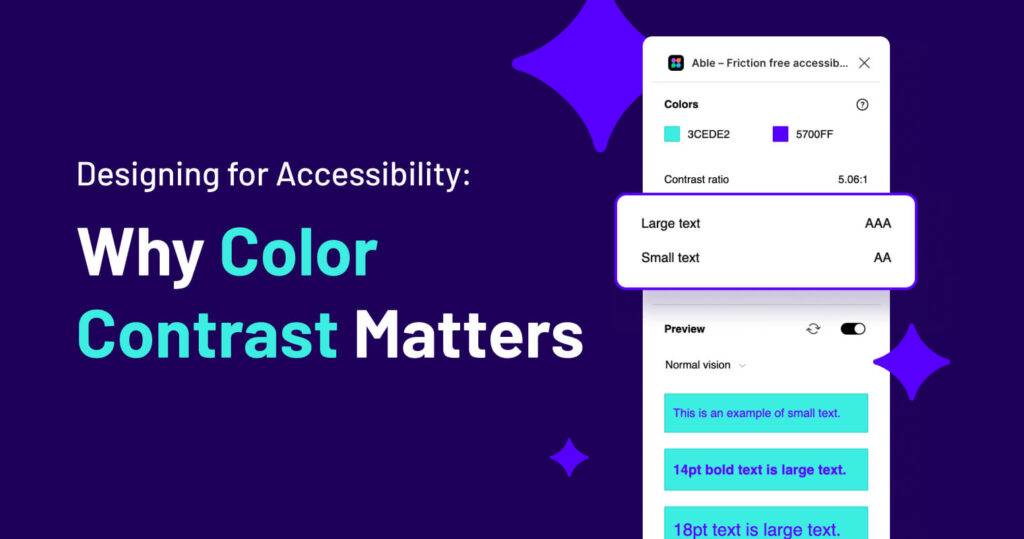
Designing for Accessibility: Why Color Contrast Matters
As a graphic designer, color is one of our most powerful tools. It sets the tone, creates visual hierarchy, and makes a design aesthetically appealing. But beyond aesthetics, color choices impact how accessible our designs are to everyone—including those with visual impairments. That’s why checking and adjusting color contrast to meet WCAG (Web Content Accessibility Guidelines) standards is a critical step in the design process.
What Is Color Contrast and Why Does It Matter?
Color contrast is the difference in brightness between two colors, typically between text and its background. If the contrast is too low, it can make reading difficult or even impossible for users with low vision, color blindness, or other visual impairments.
The WCAG sets minimum contrast ratio requirements:
- 4.5:1 for normal text (below 18pt or 14pt bold)
- 3:1 for large text (18pt and above or 14pt bold and above)
- 3:1 for UI elements like buttons and form inputs
Meeting these contrast ratios ensures your designs are legible for a broader audience, improving usability and inclusivity.
Common Color Mistakes (Bad Contrast Examples)
Here are some color combinations that fail WCAG contrast standards:
- Light gray text on a white background (#D3D3D3 on #FFFFFF) – Ratio: 1.6:1
- Yellow text on a white background (#FFFF00 on #FFFFFF) – Ratio: 1.08:1
- Bright red text on a black background (#FF0000 on #000000) – Ratio: 3.99:1 (fails for normal text)
- Blue text on a blue background (#0073E6 on #ADD8E6) – Ratio: 2.5:1
These combinations lack sufficient contrast, making them difficult to read for many users. Not to mention, they’re just awful combinations to begin with.
Good Contrast Examples
Here are some color pairings that pass WCAG standards:
- Dark gray text on a white background (#333333 on #FFFFFF) – Ratio: 15.3:1
- Navy blue text on a light gray background (#00274D on #F5F5F5) – Ratio: 12.8:1
- Dark green text on a beige background (#1B5E20 on #FFF8E1) – Ratio: 7.1:1
- Black text on a yellow background (#000000 on #FFFF00) – Ratio: 19.6:1
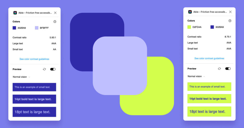
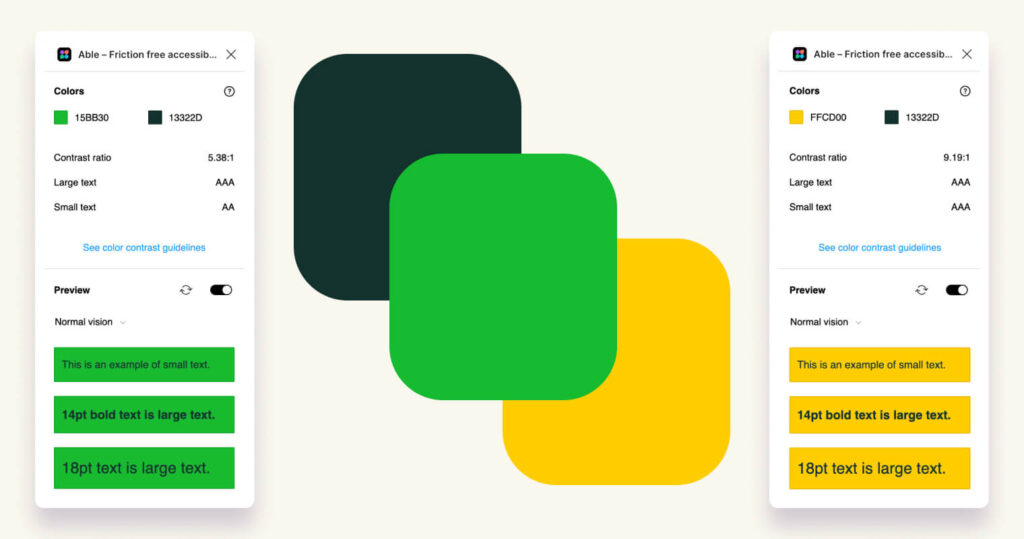
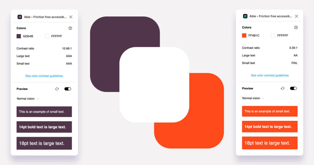
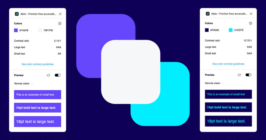
I’ll admit these examples are a little boring but you get the point here—these combinations ensure readability for users with various vision impairments. But, you can also get great color ratios with fun colors too:
Color Contrast Impacts Engagement, Too
Beyond accessibility, poor color contrast can also negatively affect actual customer engagement. If users struggle to read text, they’re more likely to leave a website, abandon a purchase, or overlook key information. High-contrast, easy-to-read designs help keep users engaged, reduce bounce rates, and improve conversion rates. Whether it’s a CTA button, product description, or navigation menu, ensuring proper contrast can make a tangible difference in user interaction and overall business success.
Tools to Check and Fix Color Contrast
Thankfully, you don’t have to guess when checking contrast ratios. Several tools and plugins can help:
- Able for Figma – A powerful plugin that checks text contrast directly in your Figma designs.
- WebAIM Contrast Checker – A simple online tool where you can input hex codes and get an instant contrast ratio.
- Contrast – A MacOS app that helps check and fix contrast issues in design files.
- Stark – A plugin available for Figma, Sketch, and Adobe XD that helps designers create accessible color palettes.
Your Takeaway
Checking color contrast isn’t just about meeting compliance standards—it’s about making sure your designs are accessible to as many people as possible. By ensuring sufficient contrast, you create designs that are not only beautiful but also functional and inclusive. Next time you’re designing, take a moment to run your colors through a contrast checker. Your audience will thank you for it!
