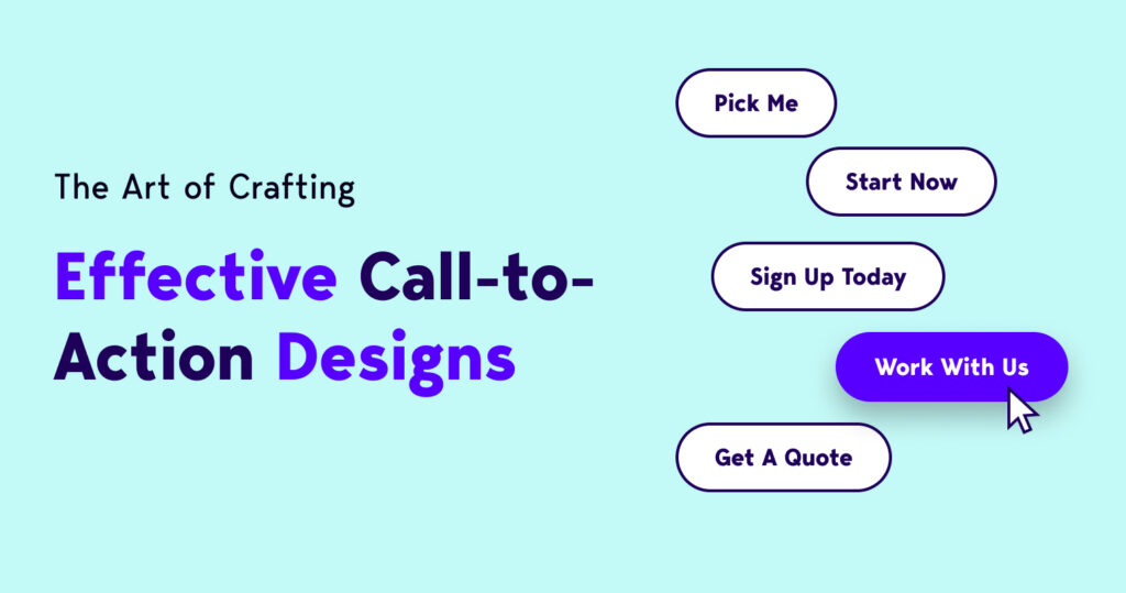
The Art of Crafting Effective Call-to-Action (CTA) Designs
Hey there, fellow digital enthusiasts! Today, I want to dive into a topic that’s crucial for every designer and marketer: creating effective Call-to-Action (CTA) designs. Whether you’re building a website, crafting an email campaign, or designing an ad, your CTAs play a pivotal role in driving user engagement and conversions. So, let’s roll up our sleeves and explore the art of crafting compelling CTAs that get results!
1. Understand Your Audience:
Before even thinking about colors, fonts, or button shapes, take a moment to deeply understand your target audience. What motivates them? What problems are they trying to solve? This knowledge will help you tailor your CTAs to resonate with their needs and desires.
2. Keep it Crystal Clear:
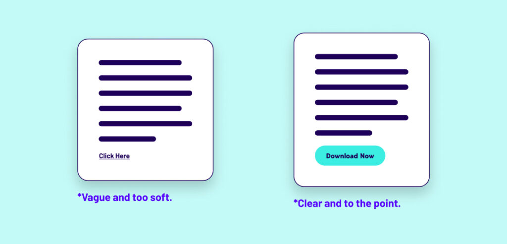
The first rule of creating an effective CTA is clarity. Users should instantly understand what action they’re being prompted to take. Use concise and action-oriented language that leaves no room for confusion. For instance, instead of a vague “Click Here,” opt for a more specific “Download Your Free E-Book.”
3. Strategic Placement:
The placement of your CTAs can significantly impact their effectiveness. They should be prominently displayed without overshadowing the main content. Above the fold is a classic spot, but don’t shy away from strategically placing CTAs throughout the page or email for better visibility and engagement.
4. Contrasting Colors:
Colors are powerful tools in design, and using contrasting colors for your CTAs can make them stand out. Your chosen color should complement your overall design palette while still drawing attention. A/B testing can help determine which colors resonate best with your audience.
5. Play with Typography:
Font choice might seem like a small detail, but it can make a big difference. Opt for fonts that are easy to read and align with your brand’s style. Experiment with font size and weight to create visual hierarchy, making the CTA text pop.
6. Use Persuasive Language:
Incorporate persuasive language that taps into emotions and conveys value. Phrases like “Unlock Exclusive Access” or “Join a Community of Like-Minded Individuals” can ignite curiosity and excitement, encouraging users to take action.

7. Incorporate Urgency:
Urgency can drive quick decisions. Incorporate phrases like “Limited Time Offer” or “Act Now” to create a sense of urgency. Just be sure to use urgency genuinely; false claims can harm your credibility.
8. Mobile-Friendly Design:
With mobile usage on the rise, it’s essential to design CTAs that are easily clickable and visible on smaller screens. Test your CTAs on various devices to ensure a seamless user experience across platforms.
9. Keep it Minimalistic:
Simplicity is key. Don’t clutter your CTA with unnecessary elements. A clean, focused design will make it easier for users to spot the CTA and understand the desired action.
10. Test and Iterate:
No CTA design is perfect from the get-go. A/B testing is your best friend. Experiment with different designs, colors, text, and placements. Analyze the results and iterate based on what resonates best with your audience.
Remember, effective CTA designs are not just about aesthetics; they’re about psychology, user behavior, and a deep understanding of your audience. By crafting CTAs that are clear, persuasive, and strategically designed, you can guide users toward the desired actions and boost your conversion rates. So, go ahead and unleash your creativity while keeping these principles in mind. Happy designing!