Branding
Designing for Accessibility: Why Color Contrast Matters
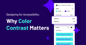
As a graphic designer, color is one of our most powerful tools. It sets the tone, creates visual hierarchy, and makes a design aesthetically appealing. But beyond aesthetics, color choices impact how accessible our designs are to everyone—including those with visual impairments. That’s why checking and adjusting color contrast to meet WCAG (Web Content Accessibility…
Read MoreThe Cardinal Sin of Color Chaos: Why Your Brand’s Palette Isn’t a Mood Ring

As a graphic designer, I’ve seen things. Horrifying things. Things that keep me up at night, clutching my Pantone swatches like a security blanket. But nothing haunts me quite like The Brand That Won’t Stick to Its Color Palette. You know the type. One day their logo is a sleek, sophisticated navy. The next, it’s neon…
Read MoreWhere Should a Small Business Start with Branding? A Graphic Designer’s Perspective

Starting a small business is an exciting journey, filled with endless to-do lists and decisions. One of the most important aspects that can shape your business’s success is branding. But when should you start thinking about branding, and how do you go about it? As a graphic designer with years of experience in brand creation,…
Read More